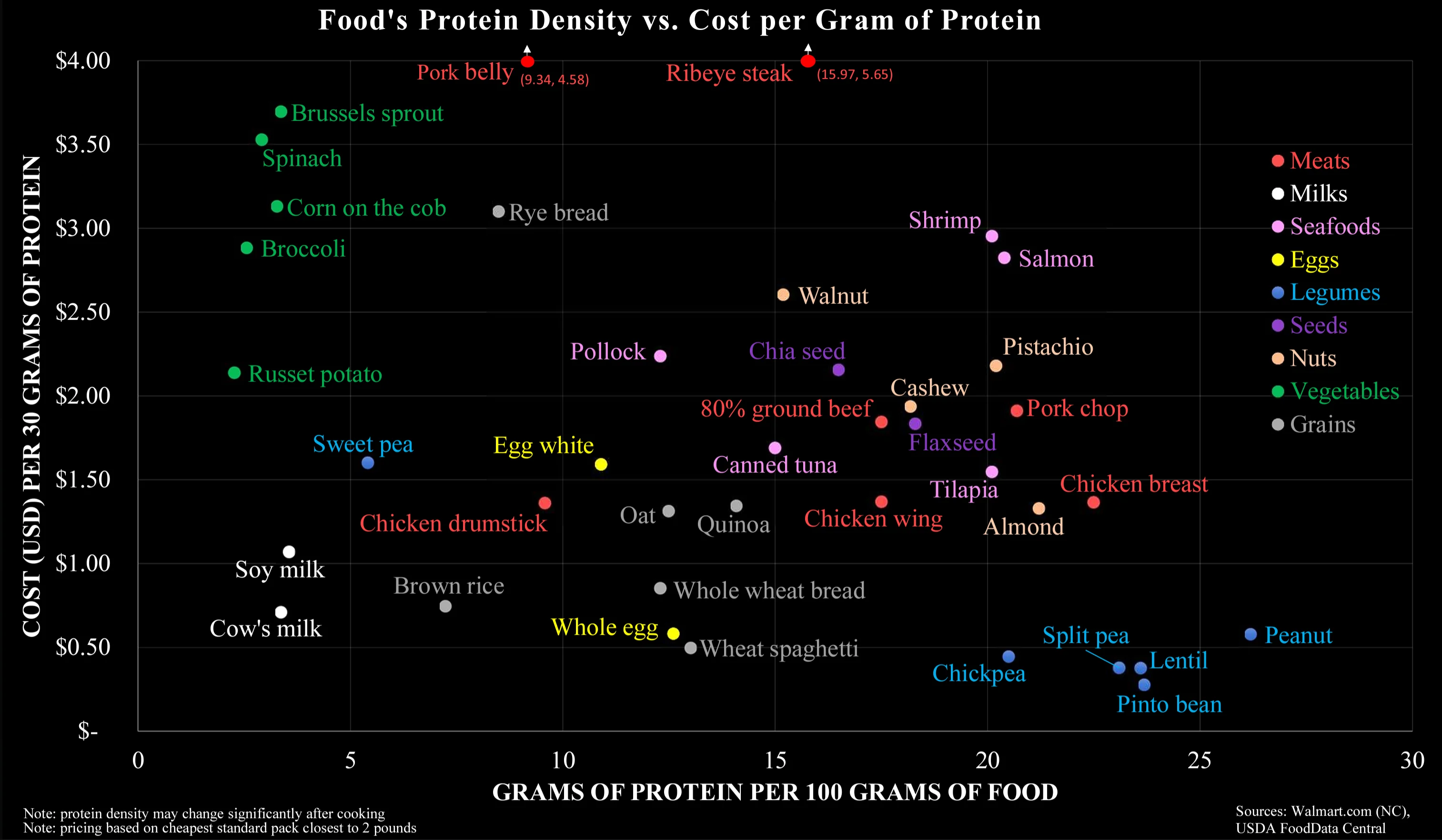
Monetary cost is the wrong y-axis here, as it optimizes only for mega-scale farming without taking its real costs in consideration. It should be ‘true cost’, which also accounts for environmental-, animal- and climate mitigation cost.
I think this is what it’s meant to be about. “How do I afford a good amount of protein with not much money?”, is the question it’s answering.
It reminds me of a Reddit post I read several years ago where someone shared their advice on how they managed to live under extreme poverty. They spent a good amount of time talking about what foods are the most cost effective to buy and this chart lines up with what they have been saying pretty well.
Yeah I don’t think this covers externalized costs
And subsidies
Indeed. I pay taxes that will become subsidies for a lot of those things in the charts, especially those I don’t even consume.
That goes from a nice little graphic to a socioeconomic PhD.
Selfish people don’t care about those factors. The existing graph has a better chance of swaying them.
That’s nice for scientists and policy makers. Not so useful for people buying things at the store.