If you come across something that doesn’t work pop it here
Superscript was reported as ^not working^
Lemmy-ui uses markdown-it-sup, so I think superscript should work on a single word like this: superscript . It won’t work if there is a space in the superscript text: ^this wont work^ . Each word must be enclosed with superscript tags: this should work
Aside from showing the right ^ it works

deleted by creator
I installed Sync just to test this. To me, that’s displaying with “not” superscript but not “working”. On web, it just doesn’t work at all (this is due to the markdown library lemmy-ui uses not allowing spaces).
Suspect ~subscript will~ also not work. Curious about
struck-out text.Okay subscript didn’t work on lemmy-ui or Sync. Struck out is fine.
How about single-word subscript? edit: yup, works in lemmy-ui, not in Sync.
deleted by creator
‘not’ is superscripted in Eternity for me
Code blocks in quotes appear a little funky.
Some line of code
> Extended quote
> ```
More code
Further extended quote
Spoiler formatting was a big one, Lemmy wants to do it like this, I think:
Some paragraph text.
Spoiler Title
Some spoiler elements
Other paragraph text.
EDIT: the main issue being Sync not displaying the spoiler title properly
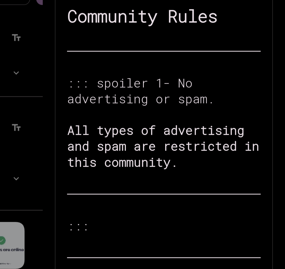
I’d also like to mention that the way it’s done in the community about page for S4L doesn’t seem to work:

1- No advertising or spam.
All types of advertising and spam are restricted in this community.
Edit: this is so confusing. It doesn’t work in the about section, but looks fine in my web interface. I don’t even know what to believe!
See also this exchange: https://lemmy.dbzer0.com/comment/9667987
!spoiler spoiler Test Comment
with line breaks!<
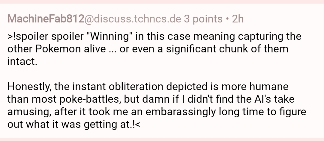
with line breaks!<``` Saw this comment in the wild which does not appear correct in Sync. https://discuss.tchncs.de/comment/8334366 In Sync it looks like this:  On Lemmy via browser, it looks like this: +1 for this, would be nice to have proper lemmy style spoilers.
Testing embedded gifs

Works when viewing this comment page but when looking at your profile page it’s blank. Is this expected?

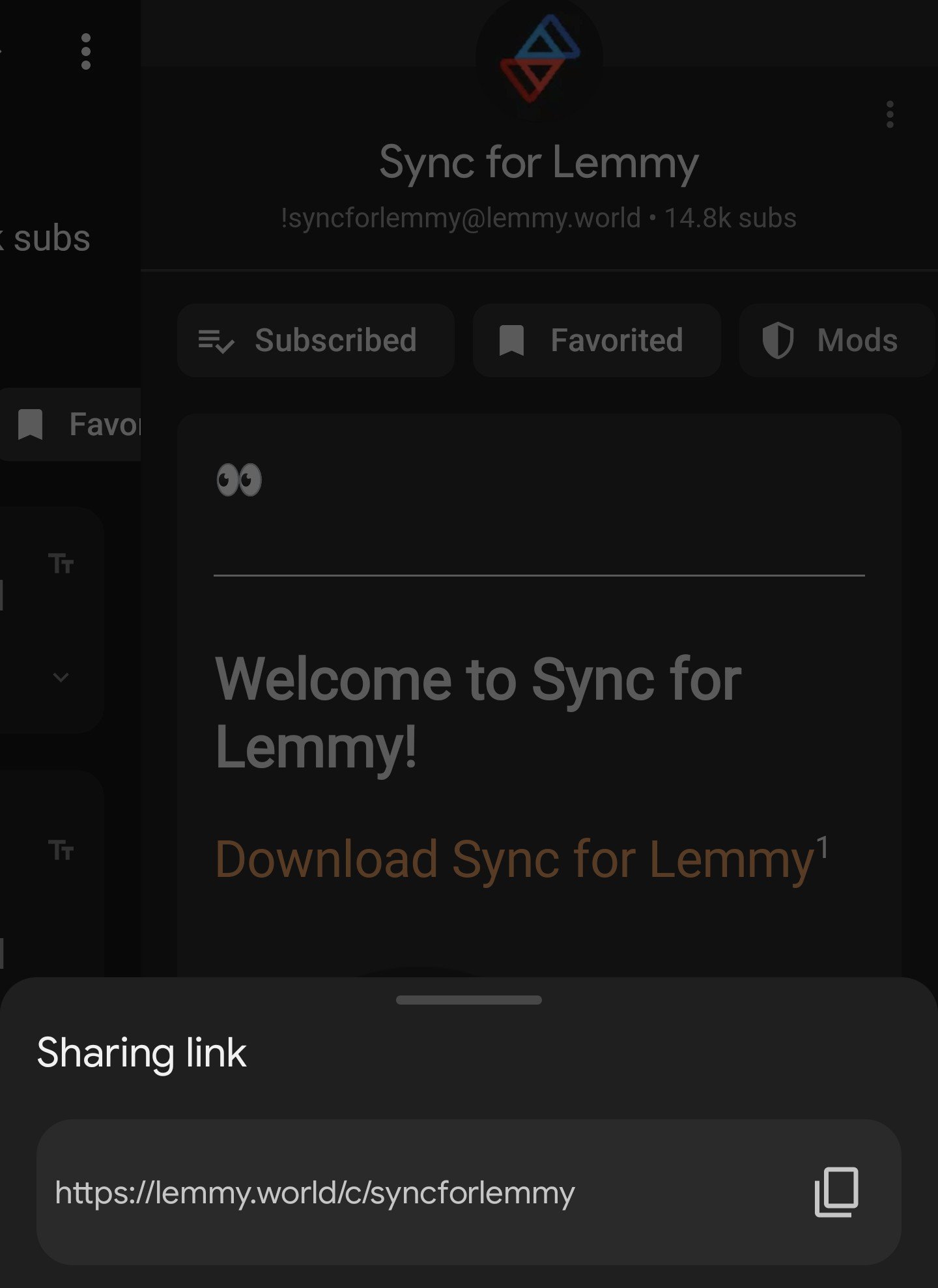
Not sure if this is the right place, but in the menu for sharing a community, the format is https://lemmy.world/c/syncforlemmy - any way to have that be !syncforlemmy@lemmy.world instead?
I believe that’s the preferred format, although I’m not sure if it’s universal across Lemmy and other apps. Both ways work in Sync.
Tricky as sharing it to someone without sync might not work well.
sharing it to someone without sync
The bang syntax will work much better for anyone on Lemmy itself, regardless of which instance they’re on or which client they use, while the URL syntax is better when users want to share a link to a community off-platform.
Ah, fair point. Maybe a concatenated version with both formats? Dunno. Not a huge issue to be fair :-)
The bullet points in my comment here render correctly in the official Lemmy frontend, but not in Sync: https://lemmy.world/comment/6271596
I’ve noticed that Sync requires two newlines between the preceding sentence and the bulleted list, but the Lemmy website does not, nor does Eternity. That appears to be the problem with the list you posted.
This might not make a bulleted list in Sync:
- one
- two
- three

This should make a bulleted list in Sync:

- one
- two
- three
Source:
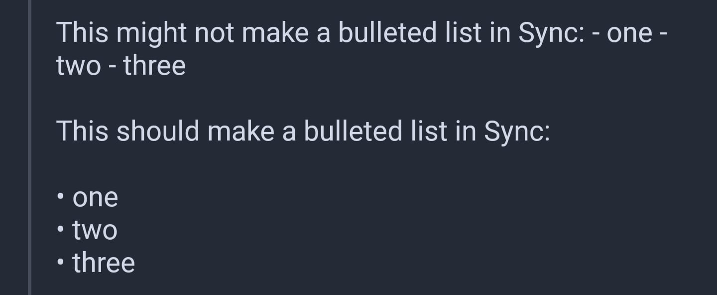
This might not make a bulleted list in Sync: - one - two - three This should make a bulleted list in Sync: - one - two - threeYes, that was the case. Sync screenshot:

-
This is an example of a bulleted list item that is long enough to likely wrap onto a second line on most phones.
-
This is another bulleted list item that is intended to do the same thing in order to see how readable they are together.
-
This is a third bulleted list item that has an additional line break between the previous list item.
-
This is an example of a numbered list item that is long enough to likely wrap onto a second line on most phones.
-
This is another numbered list item that is intended to do the same thing in order to see how readable they are together.
-
This is a third numbered list item that has an additional line break between the previous list item.
These don’t seem very readable to me, making dense walls of text. I feel like bullets and numbers should indent the paragraph to more easily see the separation between list items.
The additional line breaks aren’t doing anything, as I’m sure you can see.
The indent should be an option, if anything. At large font sizes, or small screens, that forced indent might be wasting a lot of space. Especially for nested lists.
Although, as it turns out, Sync barely indents nested lists. That alone makes it hard to read, too.
I’d support the indent you mention. It would make nested lists much easier to read, too.
- Level 1
- Level 2. Perferendis est reprehenderit saepe atque architecto sunt est. Libero quia velit qui ut non maiores porro blanditiis. Cum rerum velit modi nisi est. Qui qui in qui. Ducimus omnis dolores doloribus cumque a sunt
- Level 3. Perferendis est reprehenderit saepe atque architecto sunt est. Libero quia velit qui ut non maiores porro blanditiis. Cum rerum velit modi nisi est. Qui qui in qui. Ducimus omnis dolores doloribus cumque a sunt
- Level 4. Perferendis est reprehenderit saepe atque architecto sunt est. Libero quia velit qui ut non maiores porro blanditiis. Cum rerum velit modi nisi est. Qui qui in qui. Ducimus omnis dolores doloribus cumque a sunt
- Level 3. Perferendis est reprehenderit saepe atque architecto sunt est. Libero quia velit qui ut non maiores porro blanditiis. Cum rerum velit modi nisi est. Qui qui in qui. Ducimus omnis dolores doloribus cumque a sunt
- Level 2. Perferendis est reprehenderit saepe atque architecto sunt est. Libero quia velit qui ut non maiores porro blanditiis. Cum rerum velit modi nisi est. Qui qui in qui. Ducimus omnis dolores doloribus cumque a sunt
- Level 2. Perferendis est reprehenderit saepe atque architecto sunt est. Libero quia velit qui ut non maiores porro blanditiis. Cum rerum velit modi nisi est. Qui qui in qui. Ducimus omnis dolores doloribus cumque a sunt
- Level 1
-
I think a way to make them work is to add two spaces after each line. Here’s a test…
- Line one
- Line two
- Line three
Hopefully that works.
It did :-)
That’s a placebo and it’s not doing anything. Bulleted lists never need two spaces at the end of each line. You only use two spaces at the end of line that are not in bulleted or numbered lists.
The bug is that Sync requires a blank line before you start the bulleted list. The Lemmy website doesn’t require that.
Here is your comment with no spaces at the end of each line:
spaces after each line. Here’s a test…
- Line one
- Line two
- Line three
See? It still works fine.
Now here’s an example of what two spaces do.
The first sentence below has a new line after each word but no spaces. The second sentence has two spaces and a new line after each word. The spaces force a line break to be rendered.
This
Is
Not
A
List

This
Is
Not
A
ListSource of the above:
This Is Not A List This Is Not A ListThis feature of markdown was implemented to prevent text from emails and such from wrapping in funny ways when pasted into a comment (or whatever). Old emails often force line breaks after 80 columns of text and it looks goofy when viewed in a modern web browser if those line breaks are kept, so they are ignored. To preserve the line breaks, you add two spaces at the end of each line. That or you might prefer to write paragraphs with a hard wrap at some column, but other people shouldn’t have to suffer that.
Adding the two spaces to lines in a bulleted list does nothing useful, but it also doesn’t break it, so of course it works.
Ah, I see - thanks for the detailed explanation. I think I sort of knew that, but got mixed up when replying on bullets.
So I know that will make it look correct in sync, but I guess what I’m getting at is that the comment is an example that looks right in other clients but NOT in sync.
Sync should show the list correctly like other clients do.
Yeah, sorry, I got mixed up, so my ‘solution’ wasn’t really a fix at all.
Not sure if code blocks are supported at all (I’ll test using this comment); I know inline code strings are, but blocks I’m not sure.
Either way, in the editor, I’m missing buttons for both inserting inline code and a code block.
Speaking of messages, I can’t seem to find a way to mark a message/comment reply as unread. I would like that very much.
#!/bin/fish #Testing a block of code if true printf "yes" else printf "no" endThat reminds me: dollar signs don’t appear in code blocks.
That’s a nasty one. Hard to paste shell code 😅
Any progress being made here? I was really hoping that not being able to view certain communities such as !newbrunswick@lemmy.ca would be considering bad enough of a bug to bring a little development back.
Yup. I’m in the process of ripping out the old markdown processor.
Hey! Good to hear from you. Hope you took some good time for yourself. I appreciate the progress update on the merkdown.
I’ve been flat out on new features. Just finishing up a built in ad blocker ༼ つ ◕_◕ ༽つ
What’s it gonna do? 👀 Hopefully block ads for web pages you’re viewing?
Yup. Even managed to get websites caching and working offline too.
Any way you can block the “sign up for the newsletter” type dialogs that websites like to have? Lol
Already added (☞゚ヮ゚)☞
Markdown in the media bias bot doesn’t work as visibly intended.
Yep, I have this issue too.
Came here to report the new fact-check bot
This is a spoiler message that I unhid before editing.
>!This is a spoiler message that I unhid before editing.!<!This is a spoiler message that I left hidden before editing!<
>!This is a spoiler message that I left hidden before editing!<This is the edit.
Not sure I’d count this as a markdown bug per se, but it seems that when you un-hide a spoiler and then edit your post, it treats the post as if the spoiler had never been there in the first place.
$$f(x) = 5$$
$a = b$
While this isn’t strictly a markdown issue, it is slightly related. Link domain indicators are handled specially for Reddit, and they probably shouldn’t be.
This is a link to a Lemmy post. Sync appends
(lemmy.world)after it.This is a link to a Reddit post. Sync appends
(/comments/)after it.This is a link to an old.reddit post. Sync appends
(/comments/)after it.This is a link to a Lemmy profile. Sync appends
(lemmy.world)after it.This is a link to a Reddit profile. Sync appends
(u/ljdawson)after it.
I acknowledge that there would be technical difficulties in trying to make Sync identify ActivityPub users and posts, and the current implementation of showing the domain name is good, in my opinion.
Reddit links should probably display the Reddit domain name, however. These links are external to Sync and would open a new browser page, and it’s more informative for the user to know the domain of the link they are opening.
No text image links in post bodies. Usually see them in the format [](link here) don’t show up at all.
Do you have an example?
I think they mean they want a button to embed an image link like we have for regular links
Gotcha. Added this last night
Awesome, once again your dedication is appreciated. Already great app is starting to look perfect.
Still got some way to go but I’m making good progress!
Actually other person got it wrong, but I can confirm that it is fixed in the latest version. I don’t see examples of this very often, but I did run across one today.
deleted by creator
Testing from the redesigned messaging.
I’m not sure if you’re still monitoring this or if I should make new thread.
I just encountered a comment where they included a link with brackets in the url and it didn’t parse for me in Sync. I assumed it needed escape characters , which did make it a working link for me in app, but I got curious and checked the website and the original link worked fine there. Maybe the Lemmy web ui will escape characters in links by default?


