cenarius871@sh.itjust.works to Data Is Beautiful@lemmy.mlEnglish · 1 month agoLife expectancy 1870-2021 China, Russia and World avarageourworldindata.orgexternal-linkmessage-square16fedilinkarrow-up148arrow-down11
arrow-up147arrow-down1external-linkLife expectancy 1870-2021 China, Russia and World avarageourworldindata.orgcenarius871@sh.itjust.works to Data Is Beautiful@lemmy.mlEnglish · 1 month agomessage-square16fedilink
minus-squarePersonalDevKit@aussie.zonelinkfedilinkarrow-up4·1 month agoIt would be interesting to see this not including infant mortality. From my understanding that is where most of the “life gain” in graphs like this have come from. A graph of how much older people are living would be better represented “ignoring” for lack of a better word the babies dying

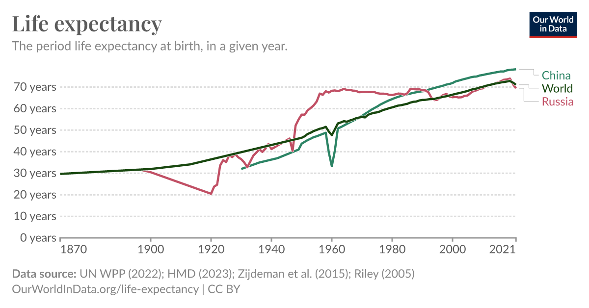
It would be interesting to see this not including infant mortality.
From my understanding that is where most of the “life gain” in graphs like this have come from.
A graph of how much older people are living would be better represented “ignoring” for lack of a better word the babies dying
deleted by creator