For me it would be:
- Monet icon and Material UI design.
- Mark read post while scrolling.
- A button to hide such read posts.
I know there are more critical functions which most of the apps are lacking like going straight to the comment from a reply, it wasn’t a big deal before because there were not many comments, but now it is becoming harder to find the context!
So far only Jerboa and Thunder qualifies the first “needs” for me!
Please share yours!
A button at the bottom right of the screen to skip to the next top-level comment.
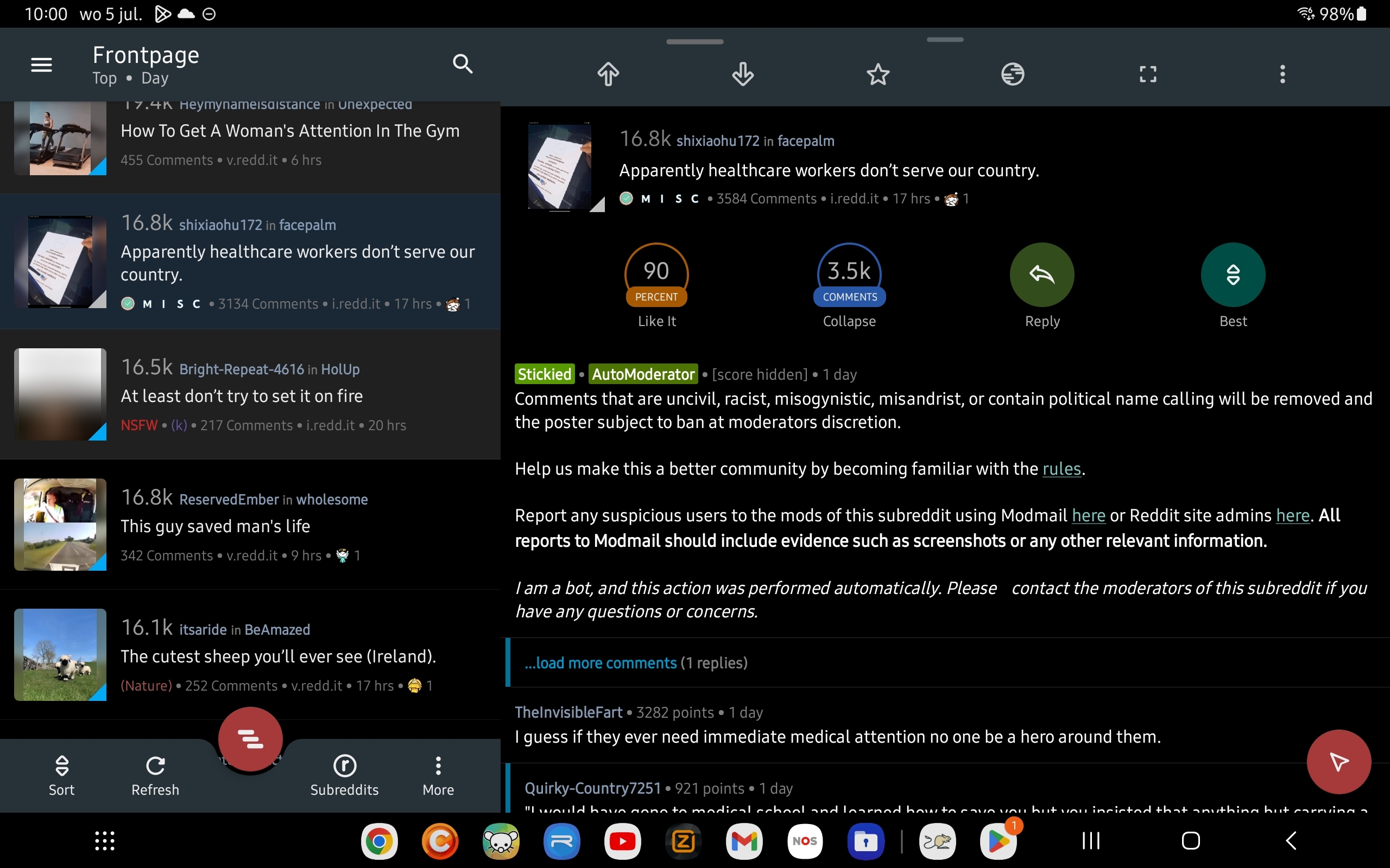
I’m using my tablet to browse Lemmy and haven’t found an app yet that has all the posts on the left side and the content of a single post on the right.
The screenshot shows an example.
Also, mark a post as read when you have opened the media and ability to hide read posts.

Pressing and holding to see a larger view of media. aka Peeking.
Swipe navigation, I’m coming from relay for Reddit, and using a left swipe to go back was really handy.
I keep trying it in jerboa and thunder … So a lot of unintentional upvotes in thunder and nothing happens in jerboa.
Next is embedded imgur/redgifs opening, which I was also accustomed to.
Clear posts that I’ve already read, but be able to see them again with refresh. Not completely gone like with the settings option. This is what I miss the most of my old Reddit client.
Sorting, if I sort by new it’s really really similar to hot right now, just one article or two different. In fact I get hot articles that are 8 mins old, something isn’t right.
Link/image handleing is hit and miss right now, sometimes they don’t expand when I “click” on them.


