

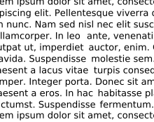
In typography, rivers (or rivers of white) are gaps in typesetting which appear to run through a paragraph of text due to a coincidental alignment of spaces. Rivers can occur regardless of the spacing settings, but are most noticeable with wide inter-word spaces caused by full text justification or monospaced fonts. Rivers are less noticeable with proportional fonts, due to narrow spacing. Another cause of rivers is the close repetition of a long word or similar words at regular intervals, such as “maximization” with “minimization” or “optimization”.
The thing that normal people don’t worry about is “readability.” Bad type is harder to read, for example rivers are distracting. Turning black marks on paper into concept, metaphor, irony, narrative, setting should be as painless of a process as possible so that the most people possible have access to reading and information. Little details like letter and word spacing, font, typeface add up to something that is either easy or difficult to read.