That 2023 line does not look ideal…
Source: The Economist
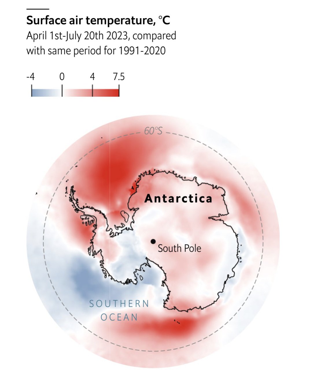
Each point represents a five day moving average. The x-axis is in terms of historical standard deviations, i.e each day is compared to the standard deviation of historical values for that year. So we are at -6 SD from the historical average for this point in time.
Other excellent visualizations are in the article!

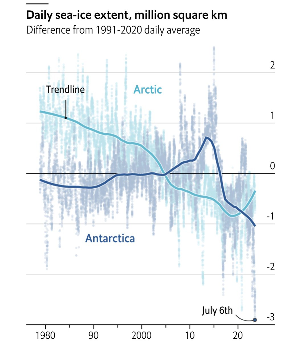
I love graphs that don’t have their axis labeled. I the first graph, y axis, what am I looking at? -2 what?
They are standard deviations, which is described in the footnote. But yeah, probably better to label that axis.