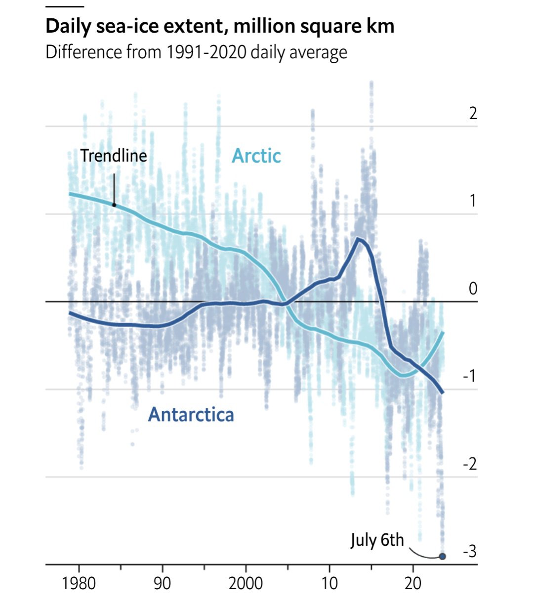
That 2023 line does not look ideal…
Source: The Economist
Each point represents a five day moving average. The x-axis is in terms of historical standard deviations, i.e each day is compared to the standard deviation of historical values for that year. So we are at -6 SD from the historical average for this point in time.
Other excellent visualizations are in the article!

[Slaps the newly exposed dirt] “It’s free real estate!”
I mean… that is literally what Russia, right-wingers, and neoliberals want…
Melt the ice, get the dino juice bc we only have 47 years of reserves left…