What were you trying to achieve and what would you like critique on?
Generally? I like the scene - and ironically I love the colors. The reds, yellows and blues are nice. But it’s rather busy overall for me. The bicycle is on equal footing visually with the man and competes for attention. The blue/red items in the left-side corners are bright enough to pull my attention to the edge and away from the man as well.
I feel like I want more of the “man” and less of the “stuff on the boat”.
I cropped in on him as an example of what I’m thinking - though it does lose the port background and some context of it being a “boat”:
But it’s your photo. This is to my taste not yours.

![[critique wanted] A man and his boat](https://feddit.nu/pictrs/image/9a31c22e-f253-44ee-955b-ff8f3ca0a115.jpeg)
What were you trying to achieve and what would you like critique on?
Generally? I like the scene - and ironically I love the colors. The reds, yellows and blues are nice. But it’s rather busy overall for me. The bicycle is on equal footing visually with the man and competes for attention. The blue/red items in the left-side corners are bright enough to pull my attention to the edge and away from the man as well.
I feel like I want more of the “man” and less of the “stuff on the boat”.
I cropped in on him as an example of what I’m thinking - though it does lose the port background and some context of it being a “boat”: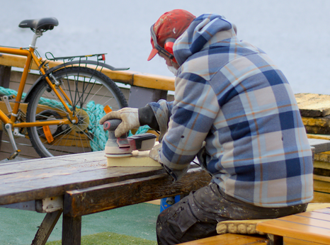
But it’s your photo. This is to my taste not yours.
Kinda agree on the noise of the bike, disagree on the crop. I enjoy how the bench, mast and beam(? Not a boat guy) frame him, focused on his work.
Not much to be done about the bike, it was there and they had to work with it.
That’s fair - the loss of the mast and things were what I didn’t like about losing the context.