
deleted by creator
i’m a software engineer and i get paid 15€/h gross. and for my country i’m considered rich.
this is in Italy.
the state of developer pays in italy is infuriating. 15/h for a developer is unbearably low, even in europe.
This is interesting to say the least. I could see myself donate towards fixing some bug that irritates me. What do others feel about this¿?
Has the Korner Bug been fixed or do we need to shell out on that too?
Maybe they can now get sponsored designer that actually knows how to work out proportions?
Sure guys keep downvoting, here is one more post. As if this was acceptable for a DE:
The worst part is that you can’t even fix it with a custom theme.
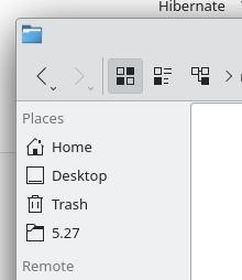
What’s the problem with this image?
Not in details view and light theme, obviously.
I dont see a problem here.
We would be glad to at least discuss this if you could please explain yourself in more detail
The problem is that any design fresh graduate would NOT design it that way. Don’t get me wrong, KDE is a great DE in terms of performance and general philosophy however it fails hard when it comes to simple design principles.
For eg. icons bellow “places” aren’t properly sized to the text, they’re abnormally large. The labels itself lack proper vertical and horizontal padding. Everything is simply crammed against everything else without the right space in between. This is also noticeable in the program icon on the top left.
If you compare the image above to both Windows and macOS you’ll see they spend a lot of time making those things right and that gives you a cohesive and polished visual experience not what KDE has now. Even xfce which doesn’t care much about visuals is doing better on those.
deleted by creator